# 用 CSS 实现固定宽高比

之前写博客样式的时候，有一个需求：文章图片容器需要固定的宽高比 `16:10`，我那个时候是用 `padding` 实现的，然后现在发现有一个更简便的实现方式。

### 使用 padding 实现宽高比

> `padding` 百分比值无论是水平方向还是垂直方向均是相对于宽度计算的！

所以，我们可以指定图片容器的宽度，然后将高度置为 0，用 `padding-bottom` 来填补需要的高度

```html
<div class="container">
  <div class="img-wrap">
    <img src="//cdn.wallleap.cn/img/pic/illustrtion/202207261246820.png" alt="cover">
  </div>
</div>
<style>
*, *::before, *::after{
  margin: 0;
  padding: 0;
  box-sizing: border-box;
}

body {
  display: flex;
  height: 100vh;
  justify-content: center;
  align-items: center;
}

.container {
  width: 80vw;
  background: #EEE;
  height: 400px;
}

.img-wrap {
  width: 100%;
  height: 0;
  background: #77CCCC50;
  padding-bottom: calc(10 / 16 * 100%);
  overflow: hidden;
}

.img-wrap img {
  width: 100%;
}
</style>
```

但是这种容器高度为 0，图片就不能使用 `object-fit` 进行设置，图片必须定制 `16:10` 尺寸的才可以完美显示，所以可以改用背景图片的方式

```html
<div class="container">
    <div class="img-wrap"></div>
</div>
<style>
.img-wrap {
  width: 100%;
  height: 0;
  background: #77cccc50;
  padding-bottom: calc(10 / 16 * 100%);
  background-image: url(https://cdn.wallleap.cn/img/pic/illustrtion/202207261246820.png);
  background-repeat: no-repeat;
  background-size: cover;
  background-position: center;
}
</style>
```

> 图片使用 img 标签还是背景图片形式取决于是否需要搜索引擎搜录，如果需要搜索引擎搜录，那么就需要使用 img 标签

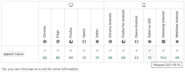
### CSS3 中 aspect-ratio 属性

在写博客样式的时候，这个还没全面兼容，现在主流浏览器都已经支持了，可以到 [MDN](https://developer.mozilla.org/zh-CN/docs/Web/CSS/aspect-ratio) 查看

![aspect-ratio](https://cdn.wallleap.cn/img/pic/illustrtion/202210121435513.png)

`aspect-ratio` 的语法格式如下：`aspect-ratio: <width-ratio>/<height-ratio>` （`/` 前后都是大于 0 的数字，后面数字为 1 时可以省略）

`aspect-ratio` 属性值也可以设置为 `auto`，相当于是默认值，这样对于图片、视频这样有原始纵横比的替换元素，就会保持原始比例

所以现在实现我们需要的效果可以：

```html
<div class="container">
  <div class="img-wrap">
    <img src="https://cdn.wallleap.cn/img/pic/illustrtion/202207261246820.png" alt="cover">
  </div>
</div>
<style>
*, *::before, *::after{
  margin: 0;
  padding: 0;
  /* box-sizing: border-box; */
}

body {
  display: flex;
  height: 100vh;
  justify-content: center;
  align-items: center;
}

.container {
  width: 320px;
  background: #ffaabb50;
  height: 400px;
}

.img-wrap {
  width: 100%;
  height: auto;
  aspect-ratio: 16/10;
}

.img-wrap img {
  width: 100%;
  height: 100%;
  object-fit: cover;
}
</style>
```

最终效果可以前往 [饥人谷JS Bin)](http://js.jirengu.com/reyoxazoku/1/edit?html,css,output) 查看


---

# Agent Instructions: Querying This Documentation

If you need additional information that is not directly available in this page, you can query the documentation dynamically by asking a question.

Perform an HTTP GET request on the current page URL with the `ask` query parameter:

```
GET https://wallleap.gitbook.io/blog/ji-shu-za-tan/yong-css-shi-xian-gu-ding-kuan-gao-bi.md?ask=<question>
```

The question should be specific, self-contained, and written in natural language.
The response will contain a direct answer to the question and relevant excerpts and sources from the documentation.

Use this mechanism when the answer is not explicitly present in the current page, you need clarification or additional context, or you want to retrieve related documentation sections.
